Product: Web Application (Data Dashboard)
My Role: UX Researcher, UX Designer, UI Designer
Project Length: 4 months (2018)
Company: WEconnect
About the Product “Dashboard”
Recovering from addiction is never a one-person job.
Many treatment centers provide outpatient services - patients periodically check in with their designated counselors. For example, a patient visits his counselor every Friday for one hour, reporting whether he has completed all the recovery routines. Here comes the problem – since everything is self-reported by the patient, the counselor has no visibility into the patient’s actual recovery progress.
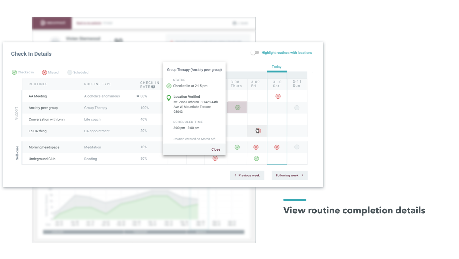
WEconnect’s product ecosystem solves the issue of self-reporting. As illustrated below, patients check into routines when they are at the location, and counselors immediately gain visibility into patients’ recovery progress.
Product Ecosystem
Here is a screenshot of the two products developed at WEconnect. I’ll specifically talk about how I designed the Dashboard product. If you wish to view the mobile app, please click here.
The Challenge
To give background information, WEconnect sold an analytics tool to counselors in treatment centers. This analytics tool was initially developed as an internal company tool and didn't consider counselors' needs and goals. Counselors were excited by the concept of the analytics tool but found it hard to use - below is an image of the failed analytics tool and the usage data that showed a decrease in user engagement.
Screenshot of the previously failed analytics tool
Screenshot of the data analysis report shows a decrease in engagement over time.
I was thrilled to redesign and reimagine this product. Knowing patients' recovery progress is a crucial piece to reduce relapse. I believe the original analytics tool had all the crucial pieces. As the product designer, I am responsible for making the product more accessible and understandable to counselors.
UX Research
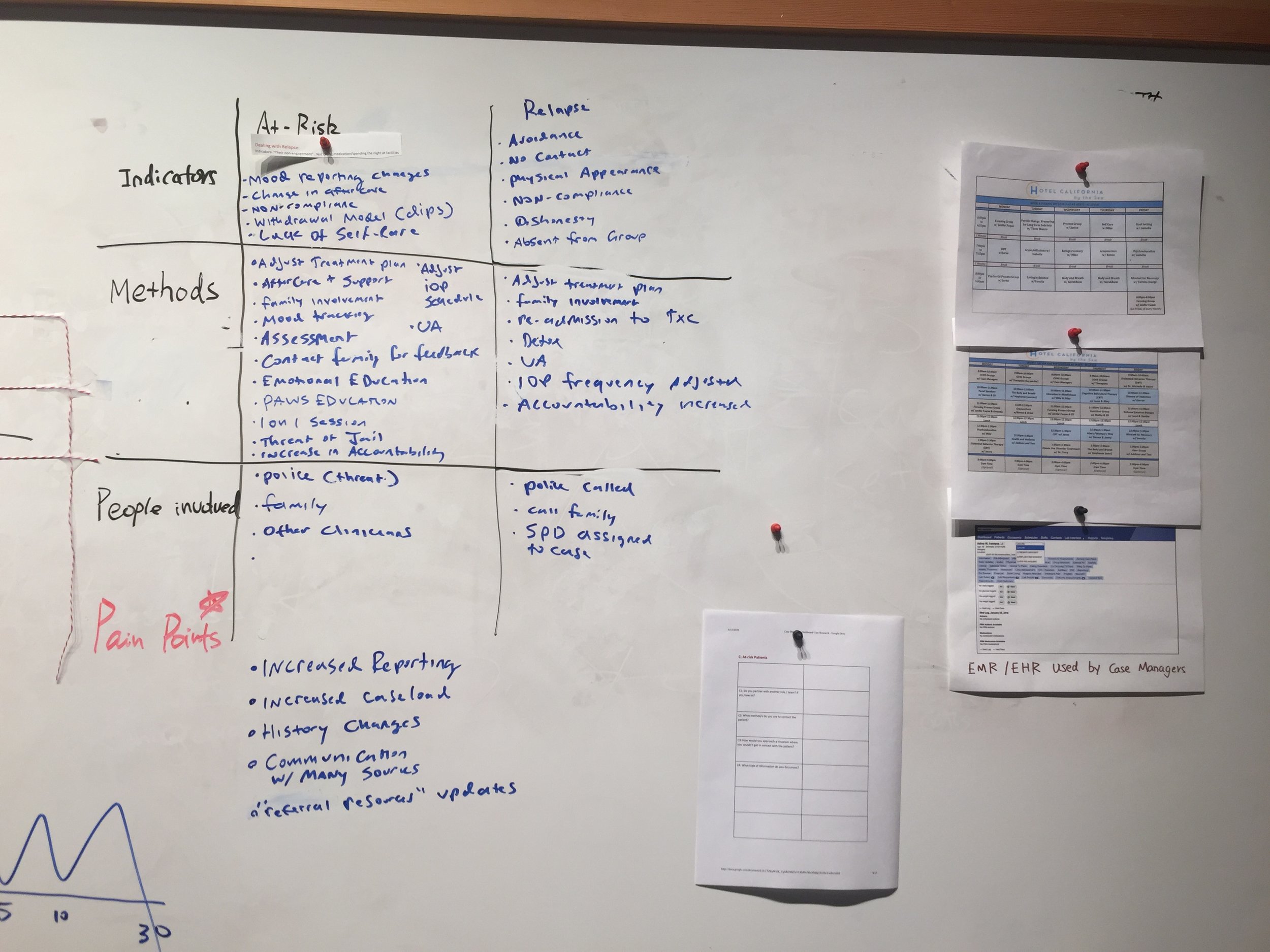
I conducted extensive counselor interviews and visited treatment center facilities. I learned how counselors engage with patients through their recovery journey, how they help relapsed or at-risk patients, and what their joys and struggles are with their responsibilities. Below are the documents I generated during this process.
“It is like herding cats, trying to get ahold of these people just to see if they are sticking to their agreed schedule.”
Working Together:
I worked with one lead developer and one data scientist. Everyone on the team was involved in the research and design phases. My amazing colleagues provided me with support in the areas below:
Different type of data that is collected from patients’ mobile applications.
Multiple approaches to present patients’ data and WEconnect’s risk model unbiasedly.
Feasibility and estimates of product features I proposed.
First Week-long Design Sprint:
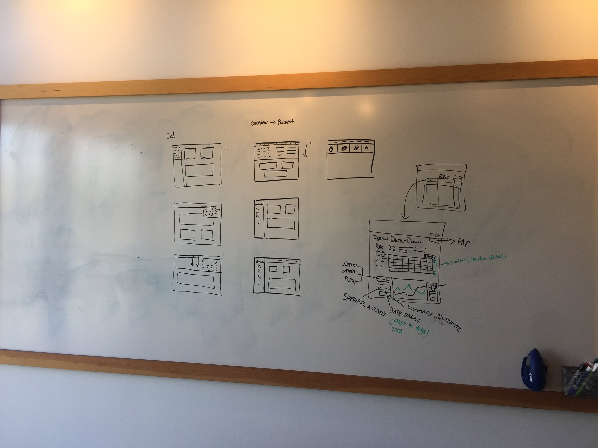
Operating on a pressing deadline, I started two one-week design sprints. In the first week, I created different versions of low-fidelity wireframes and showed them to counselors for feedback, gaining valuable information on what data is relevant to counselors and how to visualize those data.
For example, below are four versions of the low-fidelity wireframes I created:
In addition to wireframes, I had case managers rate which chart is most valuable to their work.
Second Week-long Design Sprint:
I created high-fidelity wireframes in the second week and wrote Usability Testing scripts. After testing with five counselors, I modified the original design. Here are some highlights:
1. De-emphasize historical data: The initial design allowed counselors to jump back in time. However, I learned that counselors seldom accessed data for more than one month in the past. The updated design provided a better focus on patients’ current week.
2. Provide patient summary: It took counselors a long time to interpret the chart and determine what was happening with each patient. Adhering to the “Simplify Decision-making” discipline, I added a patient summary section.
3. Clear the clutter: On the “patients overview” page, I simplified the information presented.
Visual System
I defined the visual system for the Dashboard. Below is a screenshot.
Design Implementation
I worked with developers side by side during the implementation phase, continually refining designs.
Setting up tools: I uploaded designs to Zeplin and worked with PM to write user stories on Pivotal Tracker. Developers used both tools to communicate with me daily.
Communicating with executive teams: I presented the designs to the executive team. The feedback was so positive that I was elected the employee of the month 🏆.
Responsive web design: I worked with developers side by side to optimize designs for all screen sizes.
Think beyond the happy path: "A design is only as strong as its weakest link." While the product was being developed, I carried on with less frequent use cases.
Design QA: I paired with developers from beginning to end, setting a high bar on the quality of the product.
Below is a collection of screens from Zeplin. Zeplin allowed everyone from the company to comment and to contribute their insights. After getting the stakeholders' sign-off, I worked with PM and developers to break down designs into user stories.
Post-MVP Features
I started preparing the next round of UX research. Although the MVP was for counselors only, WEconnect's product vision was to create an EMR tool that would centralize every patient's data and performance for treatment centers. For my next round of UX research, I will be focusing on the four areas below:
How to help counselors digitally prescribe recovery routines?
How to leverage WEconnect's data to obtain insurance for clients?
How would the product benefit treatment centers' CEOs?
Improve features in the current MVP based on users' and stakeholders' feedback.


